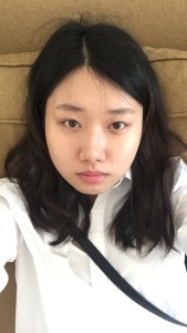
Original Photo
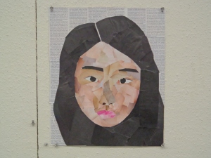
Final
This self portrait is a collage from magazine pieces using variety tones of each colors to show depth of space and scale. Different value is used between the dark grays and blacks of the hair to show highlights and shadows of the hair’s movement. The colors are pinks with white tints on face, slightly darker hues on around the face and lighter colors used on the center of the face to show little volume of the face. The texture is softer on the hair and rougher on the face. The lines of texts in the background suggest the flow from left to right. The frame is used to show negative space by having a text background and positive space is shown with curved circular shapes. Having contrasting flow differentiates the negative and positive space. The composition is asymmetrical, and the weight falls to the right side more as there is less negative space in the right bottom corner. It is a generally centered subject with very round outlines of the face. My focus visually goes around the eyes first then to the lips and around the hair to the texts in the background. The dark value of the eyes and it’s distinct circular shape brings me to the center and the pattern of the different skin tones bring my eyes around to the lips that is a vibrant color. The primary focal point is the eye and although it is it is placed on the second and third vertical lines of the “rule of thirds” grid. Illusion of space is shown through scale. The comparison of the mouth to nose to eyes and to forehead shows a measurement and proportion. This collage has an over all warm tone.
Peer Critique for Melissa’s Self Portrait
This artwork, a self portrait collage of Melissa uses elements such as, colour, value and shape. Different hue of the colors are used to show transitions in value. Highlights are shown with vibrant colors, and shadows are expressed with less saturated hues. Each group of hues form inorganic shapes. For example the darker blue round shape surrounding the face. Although the composition is asymmetrical it is well balanced by giving the centered subject, different shades on each side. The repetition of curvilinear lines and shapes brought my eyes around the frame in circular motion. The focal point are the eyes and they are placed not on an intersection but on a parallel line of the second and the third line (of the -“rule of thirds”). The illusion of space is shown through are value and scale. The brown-orange of hair, the dark blue around the face and very dark green show that they are in the background- in terms of space. Where as the top of the nose and parts of hair-bright orange, the forehead and cheek bones- light blue, show that it comes forward in the middle ground/foreground. The size of the eyes can be compared to estimate the size of the head and it can also measure the amount of highlight and shadows to see how circular/or flat the face is. This painting is closer to a warm temperature because of the over all tint is orange/yellow. The complementary colors, orange and blue are well expressed throughout the collage and interesting mixture of two colors(dark green) in the background.
The concept of this art work seems to show a hidden mischievous personality. The colors more on the shaded side show it’s not a vibrant bright face but rather has a calm and quiet feeling to it. But the slight smile on the lips and the way the eyes are angled up wards show there is more than calm and quietness to it. The eyes and lips are also emphasized by having a complementary color- orange. The over all tone is dark and closer to grey, but certain parts are a little more vibrant showing the importance of its presence.
There were many successful parts of this design. The use of dark color in the background show negative space apart from the subject which is the positive space. It showed many scales of highlights and shadows to show a sense of space, foreground and background. The contrast between the color- blue and orange was well used to emphasize a point and to make a focal point. It was designed to be balanced by centering the subject with recognizable different shades/ colors on each side. The directional force was in a circular motion started from the eyes and swirled outwards. Over all it gave the focus in the the person, and made a harmony between what I think was your concept and how it was done aesthetically. If I had to point out improvements I wish the top of the hair was in unifying colors/tones as other parts of the hair. Darker colors usually go behind. So top of the head is usually the lighter or the same tone. The design throughout the frame was successful, it had a unique color distributions which brought attention to that certain area. Design had a nice flow and different usage of hues convey an emotion to the viewers.


